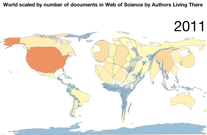
World scaled by number of documents in Web of Science by Authors Living There
About
This map was produced by Juan Pablo Alperin (@juancommander) using d3.js and cartogram.js. It was inspired by the out of date map over at worldmapper.org. Unfortunately, not much has changed. Due to differences in the implementations, the two maps cannot be directly compared to one another.
Juan Pablo is a PhD Candidate at Stanford University and a researcher with the Public Knowledge Project.
This work was carried out with the support of the IDRC-funded project, Quality in the Open Scholarly Communication of Latin America. The data are from Thomson Reuters and were collected by the Mimir Project conducted at Stanford University by Daniel A. McFarland, Dan Jurafsky, Chris Manning, and Woody Powell, which was generously funded by the Office of the President at Stanford University and by the National Science Foundation [Award 0835614].
The code (including most of this page) was adapted from the example provided by shawnbot. You can see the source code over on Juan's github.